Here’s a quick question: “How would your e-commerce store perform on a seven-second speed date? Would it be able to charm, engage and bag a second date or is it likely to be swiped away?”
While seven seconds may not seem long, human beings are used to making snap judgments based on the external appearance of a person. And, when it comes to the digital world, the time you have to make a “lasting first impression” is just a few seconds
According to research by the Missouri University of Science and Technology on eye-tracking patterns and user behavior, it takes individuals less than two-tenths of a second (200 milliseconds) to form an impression of a website online
Within this limited time, your website has to capture users’ attention to make them stay on the page; show them the personality of your brand, while presenting your overall business in the best possible light.
That’s a lot to get done in a few seconds!
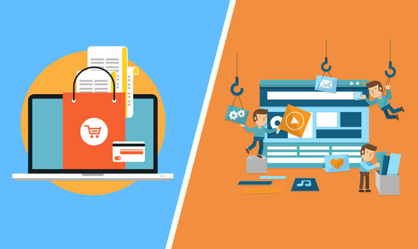
So, how do you ensure that your website is doing all that? The answer lies in your ecommerce store’s design. The design doesn’t refer to just the aesthetics. It’s much more than that. It encompasses the overall way in which users navigate, perceive and engage with your site.

See How Our Experts Can Drive More Traffic to Your Website!
SEO: Boost your rankings and drive more organic traffic today!
Website Design/Development: Create a stunning website that converts visitors into customers.
Paid Media: Reach the right audience at the right time with expertly managed paid media.
If you’re unsure whether your ecommerce website requires a redesign, here are a few tell-tale signs that indicate that it’s time for a website overhaul.
12 Signs It’s Time for Your Ecommerce Website Redesign
1. Your Website Traffic isn’t Converting into Sales
Congrats, you have a great ecommerce store that pulls in a significant amount of traffic. But, this is just the first step of the process. The focus should lay on converting your store traffic into sales. If you don’t have the necessary conversion rates, then it’s time to seek the help of an ecommerce website design company.
Expert ecommerce web designers start with usability and A/B testing of your site. They then use the help of Google Analytics and other advanced tools to find out the exact problem areas in the conversion funnel. This helps to identify the areas on your website that is preventing casual site visitors from converting to customers.
Once, the design team figures out these problems, they can then implement the right design or content solutions to overcome these issues and boost your sales volumes.
2. You’re suffering from High Bounce Rates
If you’re experiencing high bounce rates (especially on the landing page or home page), then its high time you hire the services of an expert redesign agency. A high bounce rate indicates that your users are forming a negative impression of your site or they are finding it challenging to locate the product they’re looking for. It means that something is wrong with your site layout or navigation.
A page or overall site redesign is the best way to rectify usability and branding issues at the same time. Start by focusing your redesign efforts on pages that matter most like the homepage, check out page, and product listings. You may need to A/B test different layouts for your product pages to figure out what works well
3. Updating Product Information or Adding New Products/Categories is a big Pain
An ecommerce store is miles away from a static business website. You should be able to update or modify product information without having to ring up someone to do it for you and without spending a lot of money on it.
Look for an ecommerce design that comes with an easy-to-use content management system (CMS). A CMS has an easy to use interface that lets you update/add/modify products and categories, without the need for any coding knowledge. For an easy-to-use and highly efficient eCommerce website, experts recommend that you upgrade to Magento 2.
4. Your site takes a looooong time to load
Loading time plays a crucial role in page abandonment. If your online store takes a long time to load, then you can be pretty sure that your customers are kissing you goodbye and taking their business elsewhere.
According to a new study by Google, it was found that 53% of all mobile shoppers abandon a page if it doesn’t load within “three” seconds. Also, the study stated that sites that have a page loading time of five seconds or less boasted 25% higher viewability, 35% lower bounce rate and 75% longer session time, compared to sites that took a longer time to load.
If your page load time runs high, then it’s time to look at it. Optimizing content, shrinking image files, browser caching are a few ways to reduce page load times.
5. Your ecommerce store doesn’t have a mobile-friendly design
Remember that a vast majority of your traffic comes from mobile devices. Going forward, this number is all set to grow further. According to research by Shopify, more than half of all ecommerce website traffic comes from mobile devices including Smartphones and tablets.
This is where a responsive design comes into play. Irrespective of the type of device your customers are using, a responsive website provides users with the best experience. If you haven’t switched over to a responsive design yet, you’re losing a massive chunk of your potential customers to your competitors.
Check out woocommerce specialists to update your existing design to a responsive, mobile-friendly design.
6. Your ecommerce store has Poor Image Quality
Consider this: how do you shop at a brick and mortar store? You pick a product, touch it, feel it, and sometimes even try it before you make the decision.
Online shoppers don’t have this ability. Very often, this is the first time they are laying eyes on a product. So, it’s natural that they want to examine it from every angle. If you don’t present the product in a good light – and make it appealing and attractive – you aren’t convincing your visitors to open their wallets.
All products you’re selling on your store should have at least 2-3 images. Better still, if the images show the product from different angles. For instance, for handbags, Amazon doesn’t just display the product image. Instead, it also gives customers a glimpse of the inner lining material, actual product size with the help of a silhouette of a woman carrying the bag and so on.
Also, ensure that the product images you have on your page are re-sizeable. This lets site visitors zoom in for a closer look.
The problem doesn’t stop with product images. In fact, several ecommerce stores use stock images on all static pages. This makes your store lack personality and makes it appear outdated. And, don’t make the grave mistake of using stock images for products. This makes your visitors judge the very authenticity of the products you’re selling on the store.
If you feel that your site has poor images across the board, then it’s time for a major website overhaul.
7. Your site isn’t easy to Navigate
Whether you’re selling products via your ecommerce store or using a mobile app, keep this in mind – your visitors are using your site for the first time. Make sure that you make it easy for them to navigate by providing them what they’re accustomed to on an online shopping platform.
This doesn’t mean you cannot go against the grain. However, make sure that your experiments happen in a controlled environment before you pop it in front of your customers. A website that is difficult to navigate doesn’t just curtail conversion rates but could also lead to customers abandoning your pages at an alarming rate.
For instance, the popular UK-based clothing retailer, H&M found out this the hard way. The clothing giant launched a revamped website that didn’t have a search bar. This left users confused and H&M quickly rectified this oversight.
Ensure that your ecommerce store provides customers with multi-tiered navigation that helps them locate a product quickly as well as offers them breadcrumbs for orientation. Your site navigation must not only help the visitor find a product but also subtly urge him/her to explore more and find other products that they want to buy.
8. Confusing or generic Product Information
When Google introduced its Panda update in 2013, several ecommerce stores ran into troubles due to their low-quality product descriptions. Product descriptions are nothing but the text that accompanies each product on your store.
It’s an easy way to set you apart from your competitors. Make sure that the descriptions you provide are clear, engaging and help customers know more about the product you’re selling. When customers find that product descriptions are scanty, vague or misleading, it makes them think twice about completing the purchase.
With that said product descriptions shouldn’t be too lengthy and complicated as it can cause potential customers to get disengaged. This will help you with your eCommerce website SEO too
9. Long or Complicated Checkouts
This is the mother of all ecommerce store mistakes. Several studies prove that a complicated or a lengthy checkout process is one of the main reasons why people abandon shopping carts. In fact, a complicated checkout is the third highest reason for incomplete purchases right next to shipping costs and account creation.
So, your website design must be focused on making it easy for your customers to complete the checkout process. Also, ensure that you display all shipping costs and other taxes to your customers and no information stays hidden.
10. It’s Difficult to Contact You
While this may feel like a minor thing, several ecommerce stores commit this mistake. Apart from purchasing products in your store, your customers also want to know more about your exchange and return policies.
Ensure that it’s easy for them to contact you by displaying your phone numbers and contact email id prominently on your site.
Apart from helping customers contact you, a number and other contact details build trust in your brand. Potential customers feel comfortable and secure when they know that they can reach your team easily, if any issue were to arise.
11. You bombard customers with a Lengthy Form
Imagine this scenario. Your customer has spent a good few minutes searching for products and adding them to his/her shopping cart. They are now on the verge of checking out. Out of the blue, you hit them with a long form for registration, without which it isn’t possible to complete the check out process.
In fact, data from over 1.5million site visitors shows that only 49% of all users even started filling form data. This indicates that you’re losing more than half your visitors when you bombard them with lengthy forms.
Ensure that your visitors can complete the checkout process even without having to register on the site. If you must have a lengthy form, instead of presenting it on one page, display it one section at a time. This makes it less confusing and intimidating for the user. Alternatively, you can show users the simplest part of the form first to make it seem like less of a chore.
12. Difficulties with Payment
There’s nothing as frustrating for an online shopper like payment problems. When it comes to payment, security, speed, and convenience play a vital role. All the time and efforts you spent on making the shopping experience pleasurable to your visitors come to a null if your payment process is confusing, slow or complicated.
The first step in a great payment process is to make it secure. Ensure that all the payment options on your page have an SSL certificate and 3D secure payments. The next step is to provide users with a payment option they are convenient with. Different payment methods work best for different categories of users.
So, ensure that you have at least a few different payment options like internet banking, debit/credit cards, digital wallets and even Cash on Delivery, wherever applicable.
The Last Word
If you find that your ecommerce store has one or a couple (or even all twelve) of the issues listed above, don’t panic. Get in touch with reputed Magento 2 experts or other ecommerce platform design experts based on your requirements, and start reworking on your site one step at a time.
With a brand new design that focuses on functionality and user experience, while eliminating potential issues, you can enjoy increased customers and enjoy a boost of your sales volumes.
Would you like to add anything on the list? Write in the comment section below.


