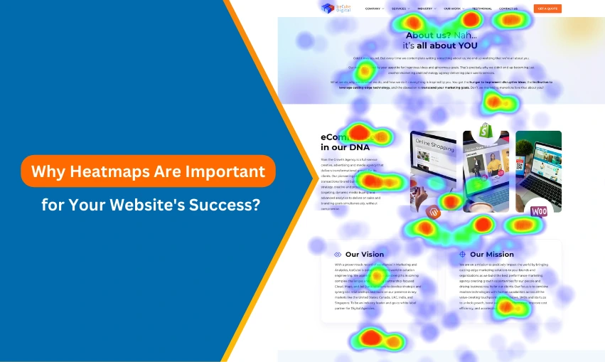
Ever wondered what visitors do on your website? Where they click, how far they scroll, or which sections they ignore? Heatmaps give you that clarity. They track user interactions and visualize them with color-coded data. The hotter the spot, the more engagement it gets.
People don’t just browse—they interact. But do you know what catches their attention? Or what they skip without a second glance? That’s where heatmaps help.
Understanding user behavior isn’t optional. Most people won’t give a website a second chance. It just takes a slow page, a messy layout, or a complicated checkout for them to go. After a negative experience, over nine out of ten internet customers never return.
Looks matter, but function matters more. A responsive eCommerce website should feel smooth, not just appear polished. It needs to load fast, work on any screen, and make shopping easy. Anything less, and customers move on.
This blog will cover:
- What heatmaps are and how they work
- Key benefits for UX, conversions, and engagement
- How to use them effectively on different types of websites
- Common mistakes to avoid
Let’s dive in.

See How Our Experts Can Drive More Traffic to Your Website!
SEO: Boost your rankings and drive more organic traffic today!
Website Design/Development: Create a stunning website that converts visitors into customers.
Paid Media: Reach the right audience at the right time with expertly managed paid media.
What Are Heatmaps?
Heatmaps are data visualization tools that track and display user interactions on a website. They use color-coded overlays to represent activity levels, making it easier to analyze engagement patterns. Warmer colors (red, orange, yellow) indicate high interaction areas, while cooler colors (blue, green) highlight less engagement.
Types of Heatmaps
1. Click Maps
- Track where users click the most.
- Help identify high-performing CTAs, dead clicks, and distractions.
- Useful for optimizing button placements, navigation, and interactive elements.
2. Scroll Maps
- Show how far users scroll down a page.
- Help determine where engagement drops off.
- Useful for adjusting content placement and prioritizing key information.
3. Movement Maps
- Capture cursor movement across the screen.
- Indicate areas of user interest before they click.
- Useful for analyzing user focus and improving layout design.
How Heatmaps Visualize User Interactions
Heatmaps translate raw interaction data into an intuitive format. Instead of sifting through complex analytics, website owners can see engagement levels at a glance. This helps in identifying usability issues, improving navigation flow, and enhancing content placement. Combined with other analytics tools, heatmaps provide a clear, data-driven approach to website optimization.
How Heatmaps Work
Heatmaps collect and analyze user behavior data to visualize interactions on a webpage. They track clicks, scroll depth, and cursor movement, helping businesses refine their website’s structure and functionality. Many eCommerce web design services integrate heatmaps to optimize layouts, improve conversions, and eliminate friction points in the shopping experience.
Data Collection Process
Heatmaps gather data through tracking scripts embedded in a website. These scripts log user actions, including clicks, scroll activity, and mouse movements. The data is then processed and displayed as a heatmap overlay, where engagement intensity is represented through color variations. Most heatmapping tools allow segmentation based on user demographics, traffic sources, and device types.
Interpretation of Heatmap Colors and Patterns
Heatmaps use a color gradient to indicate interaction levels:
- Red, orange, and yellow signify high engagement areas. These could be popular CTAs, frequently clicked buttons, or key content sections.
- Blue and green indicate lower interaction zones. These areas might require design changes or content adjustments to boost engagement.
- Cold zones (gray or no color) highlight sections that receive little to no interaction, which could suggest poor visibility, irrelevant content, or usability issues.
Differences Between Desktop and Mobile Heatmaps
User behavior varies across devices, and heatmaps reflect these differences:
- Desktop heatmaps show wider movement across the screen since users navigate with a mouse. Cursor tracking is often a good indicator of reading patterns.
- Mobile heatmaps highlight tap and scroll behaviors. Since touchscreens operate differently, users may interact more with swipe gestures, requiring different UI optimizations.
By comparing desktop and mobile heatmaps, businesses can adjust design elements for better responsiveness, ensuring a seamless experience across all devices.
Benefits of Using Heatmaps on Your Website
Heatmaps provide a data-driven approach to improving website performance. They reveal how users interact with a site, helping businesses make informed design and content decisions. When evaluating questions to ask for an eCommerce website, heatmaps can offer clear answers about user engagement, pain points, and conversion barriers.
- Improved User Experience (UX): A well-designed website should feel intuitive, but assumptions aren’t enough. Heatmaps highlight pain points and friction areas, such as elements users expect to be clickable but aren’t or sections that get ignored. By identifying these issues, businesses can streamline navigation and enhance usability.
- Optimized Conversion Rates: CTAs, product pages, and checkout buttons should attract attention. If users aren’t clicking where they should, heatmaps can uncover why. Click maps and movement maps reveal user focus areas, helping optimize CTA placement, button design, and content hierarchy to drive conversions.
- Better Content Strategy: Not all content gets equal engagement. Scroll maps show where visitors lose interest, while click maps highlight which links attract attention. This data helps refine content placement, formatting, and prioritization, ensuring key messages aren’t overlooked.
- Enhanced Website Navigation: A website with confusing navigation frustrates users and leads to drop-offs. Heatmaps help detect usability issues, such as menu items that aren’t getting clicks or essential links that users struggle to find. Adjusting the layout based on heatmap insights improves overall site flow.
- Reducing Bounce Rate: If visitors leave without taking action, heatmaps can help pinpoint why. Low interaction areas, ineffective CTAs, or confusing layouts contribute to high bounce rates. Addressing these problems with targeted improvements keeps users engaged and increases retention.
By using heatmaps effectively, businesses can remove guesswork from website optimization, making data-backed decisions that improve performance and user experience.
Practical Applications of Heatmaps
Heatmaps aren’t just for tracking clicks—they reveal how users navigate a website, where they engage, and where they drop off. Whether it’s an eCommerce store, a blog, or a lead generation site, heatmaps provide real-time insights to improve performance and conversions. Even industries like furniture website design rely on heatmaps to understand user behavior and optimize product pages for better engagement.
-
E-commerce Websites – Analyzing Product Page Engagement and Checkout Flow
Not every product page converts well. Heatmaps show which sections get attention and where users hesitate. Are customers clicking on images instead of “Add to Cart” buttons? Are they dropping off before reaching the checkout page? By tracking scroll depth, clicks, and movement patterns, businesses can fine-tune product descriptions, CTA placements, and checkout flows to boost sales.
-
Landing Pages – Measuring CTA Effectiveness and Scroll Depth
A landing page should guide visitors toward a single action. If conversions are low, heatmaps help identify what’s working and what’s not. Are users scrolling past key information? Are they ignoring the primary CTA? Analyzing these insights allows marketers to reposition elements, adjust messaging, and improve layout for maximum impact.
-
Blogs & Content Sites – Identifying High-Engagement Sections
Not every paragraph gets read. Scroll maps reveal how far users go before they lose interest, while click maps highlight which links or buttons attract attention. If users stop halfway through an article, it might need a stronger hook or better formatting. Adjusting content based on engagement data keeps readers on the page longer.
-
SaaS & Lead Generation Sites – Optimizing Form Placement and Lead Capture
Lead generation depends on smooth user flow and intuitive form design. Heatmaps help pinpoint areas where users hesitate or drop off. If visitors hover over a form but don’t fill it out, the fields might be too long or intimidating. Small changes—like reducing required fields, tweaking button text, or repositioning forms—can increase conversions significantly.
Heatmaps vs. Other Analytical Tools
Heatmaps provide a visual representation of user behavior, but they’re not meant to replace traditional analytics tools. Instead, they work alongside platforms like Google Analytics and A/B testing to offer deeper insights into how users interact with a website, not just what they do.
Differences Between Heatmaps and Traditional Analytics
- Google Analytics vs. Heatmaps
- Google Analytics focuses on numbers—bounce rates, session duration, and conversion data. It tells you what’s happening but not necessarily why.
- Heatmaps fill that gap by showing user interactions visually. They reveal which areas attract clicks, how far users scroll, and where engagement drops off.
- A/B Testing vs. Heatmaps
- A/B testing is great for comparing two versions of a page but doesn’t explain why one performs better.
- Heatmaps help diagnose issues before running tests. They highlight weak spots in design or content, making A/B tests more effective.
Why Heatmaps Complement Existing Tools
- Identify Hidden Issues – Google Analytics may show a high bounce rate, but a heatmap can reveal that users aren’t seeing an important CTA because it’s placed too low.
- Validate A/B Testing Ideas – Before testing a new layout, heatmaps help pinpoint problem areas, ensuring that A/B tests focus on meaningful changes.
- Improve UX with Visual Data – Traditional analytics rely on numbers, while heatmaps provide an intuitive way to understand user frustration points and optimize design accordingly.
Instead of choosing between heatmaps and other analytics tools, combining them offers a complete picture of user behavior, leading to smarter decisions and better website performance.
How to Implement Heatmaps on Your Website
Heatmaps track user behavior by collecting data on clicks, scrolls, and movement. Setting them up is straightforward, but knowing where to focus makes a difference.
Popular Heatmap Tools
Several tools provide heatmap tracking with different features.
- Hotjar records clicks, scrolls, and movements. It also includes session recordings and feedback tools.
- Crazy Egg offers click tracking, A/B testing, and reports that break down clicks by traffic source.
- Microsoft Clarity is a free tool with heatmaps and session recordings. It integrates with Google Analytics.
Setting Up a Heatmap
- Pick a tool – Choose one that fits the type of data you want.
- Install the script – Copy and paste a tracking snippet into your website’s code.
- Select key pages – Product pages, landing pages, and checkout flows provide useful data.
- Let it run – Gather enough visits before analyzing results.
- Review the data – Look at heatmaps alongside other analytics tools.
What to Look For
- Click activity – Buttons and links should get the most attention. If people are clicking elsewhere, something may be distracting them.
- Scroll depth – Important content should be in sections users actually see.
- Dead clicks – If visitors try to click on something that isn’t interactive, that could be a problem.
- Mouse movement – On desktops, where people hover can show what catches their attention.
A heatmap won’t fix a website, but it shows where people get stuck or lose interest. Making changes based on real behavior, rather than guesswork, leads to better results.
Common Mistakes to Avoid When Using Heatmaps
Heatmaps make user behavior easy to understand, but they can also lead to wrong conclusions if not used correctly. Many websites tweak layouts based on heatmap data alone, only to see no improvement—or worse, a drop in conversions. Understanding where users click is helpful, but knowing why they click (or don’t) matters just as much. That’s why businesses often combine heatmaps with professional SEO services and other analytics tools to make informed decisions.
-
Misinterpreting Data Without Context
A red-hot area on a heatmap doesn’t always mean success. Users might be clicking on a broken link, expecting an image to be interactive, or struggling with poor navigation. If people are clicking on something that shouldn’t be clicked, that’s a problem—not an achievement. Reviewing heatmap data alongside actual conversion rates, session recordings, and user feedback helps avoid costly mistakes.
-
Relying Only on Heatmaps Without Other Insights
Heatmaps are useful, but they don’t tell the whole story. They show what’s happening, but not why. A page might get a lot of clicks, yet still have a high bounce rate or low sales. That’s why businesses pair heatmaps with Google Analytics, A/B testing, and SEO analysis to see the full picture.
-
Ignoring Mobile and Tablet User Behavior
A design that works well on desktop may fail on mobile. Scroll maps often show mobile users don’t go as far down the page as desktop visitors. Click maps may reveal people tapping on elements that weren’t meant to be interactive. If heatmap analysis doesn’t include mobile and tablet data, decisions could be based on incomplete information, leading to changes that hurt user experience instead of improving it.
Heatmaps are powerful, but they work best when used alongside SEO, usability testing, and data-driven optimization strategies. They show what’s happening, but the real value comes from figuring out why—and acting on it.
Conclusion
Heatmaps take the guesswork out of website optimization. They show where users click, how far they scroll, and what they ignore, helping businesses make smarter design and content decisions. But relying on heatmaps alone isn’t enough. To see real results, they should be combined with SEO, analytics, and conversion rate optimization.
That’s where Icecube Digital comes in. As a team of experts in professional SEO services, web design, and digital strategy, we help businesses turn heatmap data into real improvements. Whether it’s optimizing an eCommerce store, improving user experience, or increasing conversions, we provide the right solutions backed by data-driven insights.
Want to make the most of your heatmap data? Partner with Icecube Digital and take your website’s performance to the next level.


